
Creative work shaped by strategy, craftsmanship, and purposeful design.
Every project represents a unique creative journey where ideas are transformed into meaningful visual experiences. Through thoughtful direction, refined execution, and attention to detail, each solution is designed to strengthen brands, engage audiences, and leave a lasting impression.
"The strongest creative work is built on thoughtful ideas, refined execution, and a clear creative vision."
Five projects shaped through clarity, structure, and execution.
360LUX Fashion
A luxury fashion brand needed a visual system that could carry the same premium feeling across every touchpoint: business card, product tag, packaging, thank-you card, flyer, website and signage. The goal was not to add more design, but to create a cleaner identity that felt consistent, polished, and easier to present.
 |
|---|
 |
 |
 |
 |
 |
 |
 |
 |
 |
SHIFT
The identity became consistent, polished, and easier to present everywhere.
GAP
The brand needed one clean premium direction across every touchpoint.
GENIUS FUNDS
Genius Funds required a modern digital experience that simplified navigation and improved how users interacted with its platform. The project focused on creating intuitive user flows, structured layouts, responsive interfaces, and a refined visual system that made the product easier to explore and more engaging across every screen.
 |
|---|
 |
 |
SHIFT
Designed a seamless user experience that improved clarity, & digital interaction.
GAP
Complex navigation and inconsistent interfaces reduced usability and engagement.
AGELESS GLOW
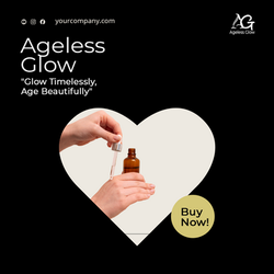
Ageless Glow wanted its marketing materials to communicate with greater clarity and consistency across multiple channels. The project focused on designing campaign visuals, promotional graphics, social media assets, print materials, and digital content that worked together as one cohesive visual communication system.
 |
|---|
 |
 |
 |
 |
 |
 |
SHIFT
Developed a unified visual communication system that improved engagement and recognition.
GAP
Marketing assets lacked consistency, impact, and visual alignment.
Dr. Kristi
Dr. Kristi already had deep expertise, decades of clinical experience, and a strong philosophy around integrative veterinary medicine. The audit focused on identifying where her online presence was not fully communicating that authority, and how the brand could become clearer, stronger, and more positioned for wider visibility.
 |
|---|
 |
 |
 |
 |
 |
SHIFT
The brand direction became clearer, more authoritative, and easier to expand.
GAP
The authority was already there, but the positioning was not carrying its full weight.
Dave B
Dave needed a clearer way to understand how his writing presence was being received before the structure became too fixed. The work focused on reading the page, tone, bio, first impression, and overall presence so the direction could feel more intentional, recognizable, and aligned with the kind of reader he wanted to attract.
SHIFT
The page became easier to understand, position, and refine.
GAP
The writing had depth, but the public presence needed clearer shape.
 |
|---|
 |
 |
 |
 |